Pick the Font2Represent
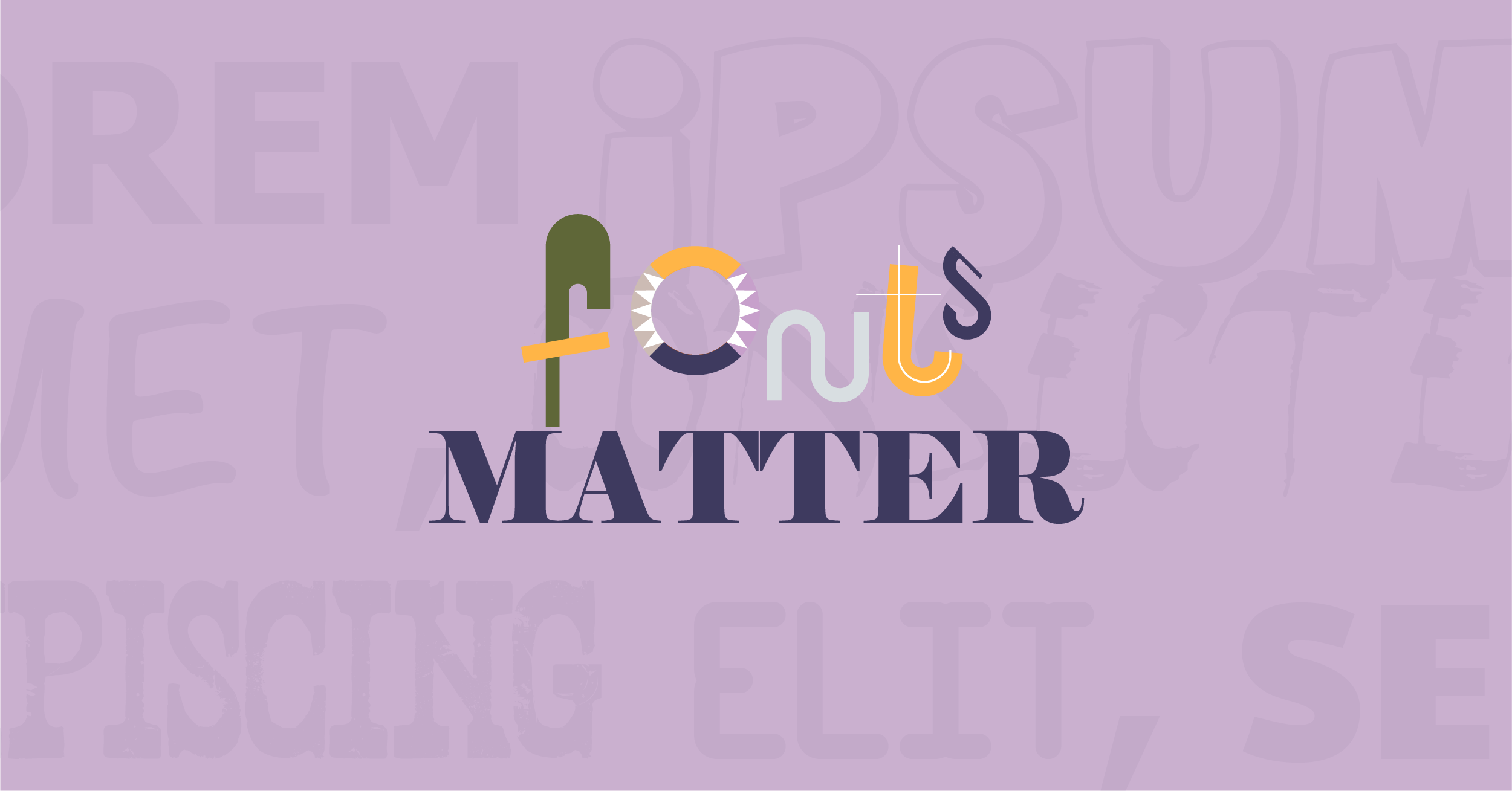
Fonts matter.
So often in business a great deal of time is spent focusing on what we’re writing and that’s important. At the same time, it’s important to evaluate the appearance of what is written. Taking a closer look quietly makes a difference in the way copy is presented.
I have three distinct perspectives from which I write business communications.
Intentionally, I have different signatures for each of three organizations in which I’m involved, and I use different fonts (and often colors) for each one. Sometimes when I am writing I find it helpful to present the emails in the style that represents that company’s branding or approach.
For example, when I am writing for 5Points Creative, I use the Tahoma font and accentuate things in the eggplant and gold hues that represent our company. There is a certain style that accompanies a creative firm like ours and I use these tools to help me frame my messages and stay focused on that look and feel. That’s the one you’re most familiar with.
Seven years ago along with a few fellow community leaders, I founded a local non-profit music venue called The Spot on Kirk. It’s a quaint listening room and live entertainment joint that fits just over a hundred people. Since its grand opening, we’ve presented almost 500 shows. Some are big time performers who have grown into their own. Other acts have already had their time in the spotlight and are touring the country playing in places like ours. For that communication I use Calibri and stick with black and white to match our branding.
During COVID, I partnered with a former client and a trusted friend to start a Software as a Service (SaaS) company for which we named, branded, and support the sales efforts. PreView.tech is a sales and visualization solution that makes the sales process more efficient in the kitchen, bath, and production home building arenas. For this company I use Arial and a complementary blue font.
Focused4the Right Look
So, I’d encourage you to think about the whole idea of evaluating the appearance of what you’ve written and understand why. Take the time to pause and double check tone, approach, and confirmation of clearly communicating your message.
It’s not a multiple personality thing. Don’t worry. It’s a multiple font thing and it’s intentional.